Foldable, a road still uphill….

Foldable
Among the various polls that we usually take to you to better understand the thoughts and desires of the tech fan base, that of the last week is perhaps to be considered as one of the most important. After having asked your thoughts on Foldable technology, we are today to comment and share with you the results of what is to be considered as one of the great issues of current mobile technology. Will users have finally shown a clear direction in this regard?Still too soon?
Thanks to the release of the two brand new Samsung products for the Foldable market, never a period could be better to face the folding question, asking you if finally the users and the market were ready for the mass arrival of this new technology, in order to overcome boredom and "flatness" made of products that have become more and more identical to each other.The truth, however, is that, according to your votes, the desire for revolution and novelty is still clashing against some limits and fears that still seem difficult to overcome. The results tell of an almost perfect division between users who seem ready for the "big step" (about 20% of voters), in contrast, however, almost equally with those who judge these products not yet suitable and ready for daily use (even here with about 20% of the votes).
Despite the great efforts made by Samsung in the last few periods, the player further forward in the competition without forgetting Huawei and Xiaomi well present in the game with their ideas and their products, users still seem frightened by issues such as resistance and ease of use, dictated precisely by the various moving parts present for obvious reason in a Foldable product.
Fragility is in fact the central issue for about a fifth of voters, who consider these products still too immature to be able to compete with traditional smartphones. From this point of view, however, the introduction of hardware innovations in the outgoing products (one above all the advent of IP certification against dust) as well as a constant improvement of the bodies and the opening and closing mechanisms are certainly to be judged as positive. in what appears to be the next big area of investment for companies interested in winning the Foldable challenge.
Prices as a tip of the balance
Among those who do not feel ready due to fragility and those who still just cannot evaluate this category of products as "useful" in general (still about 15% of you), the price theme is still certainly a great distinction, capable of accentuating the critical issues and lowering the " monkey "in those who are not yet fully convinced.In fact, more than 20% of you still consider entry prices as too high, thus discarding these products, even if perhaps onsidered as interesting and potentially useful. In this we must also consider how the value for money is not yet the best, with the desire of companies to innovate that collides with physical limits that are still insuperable, with the consequent conservative choice regarding some components considered fundamental by users ( batteries and camera compartments above all).
Considering therefore the great importance of this issue, and the still great uncertainty photographed by these results, what do you think? Do you find yourself in these results or are you already reading and commenting on us with your Foldable?
Buy the brand new Foldable Samsung Galaxy Z Fold3 5G, at the best price on Amazon.it
Galaxy Z Flip 3 review: Samsung's best foldable yet is still a tough sell
Image Credit: David Imel for Engadget
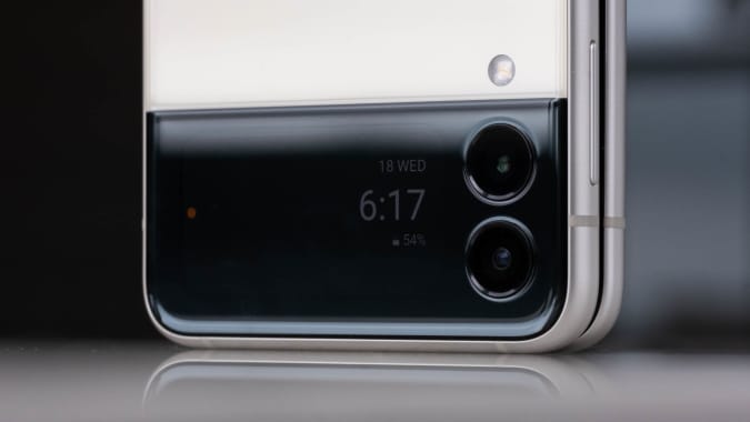
A bigger, more useful Cover DisplayThe greatest difference between the Flip 3 and a typical smartphone is that you can close it, which is not only a satisfying means of putting your phone away, but also introduces a new way to interact with the device. The 1.9-inch external screen is four times larger than the previous model, and can show up to four lines of notifications at once. There are currently six widgets available for this window, which Samsung calls the Cover Display. To interact with this panel, you’ll have to first double tap on it, then swipe vertically or horizontally to see your notifications or widgets respectively.
This was a little confusing initially, as I didn’t know I needed to tap the screen before swiping. But after figuring it out, I’ve come to appreciate it because it prevents accidentally dismissing notifications and skipping songs on Spotify. That’s pretty helpful since I often unintentionally touch the Cover Display when closing the phone or picking it up.
Most of the time, I leave the Flip 3 closed until I need to reply to a message or when I start browsing my feeds. It’s certainly a lot less distracting to be able to put my phone aside and not have a long list of notifications that I can see from a distance. I initially set all six widgets to appear on my Cover Display, so scrolling sideways would bring up the weather, media controls, Samsung Pay, Health, Calendar and so on.
While I appreciated having all those options, after a while it became clear three widgets is plenty — the endless swiping got tiring eventually. The software is also a little buggy at the moment. The alarms widget, for example, will randomly abandon its countdown if you pause and resume it.

David Imel for Engadget
Another feature that sounds great in theory is using your Cover Display as a viewfinder. With the larger panel, you’ll have more room to frame up your selfies on the Flip 3 with the screen closed. I used it to snap a picture with three staff members of my building and while we were able to squeeze everyone in, the novelty wore off quickly.
The only time I can see preferring the outside screen as a viewfinder is if you need the sharper or wider rear cameras or when you’re really in a hurry and can’t spare the one or two seconds it takes to open the phone. I like that Samsung gives us this option, but even a selfie-obsessed person like me was never in that much of a rush to snap a portrait. Plus, the photos taken this way end up in a strange squarish crop, while those snapped using the main screen as a viewfinder are taller or wider.
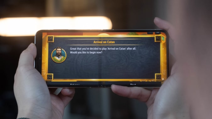
Internal screen and Flex modeWhen you’re back on the main screen, aspect ratio is still somewhat of an issue. The Flip 3’s 6.7-inch display runs at 2,640 x 1,080, which comes up to an uncommon 22:9 format. This didn’t cause too many problems — most apps fit nicely on the screen — but every now and then something will overflow. The pop-up dialogs in Settlers of Catan, for example, disappear into the edges of the display and I can barely tap the buttons I need to move on.

David Imel for Engadget
Fortunately, I didn’t encounter this on most of my frequently used apps, but for now Samsung doesn’t have a workaround to help ensure you can see everything on the Flex.
That’s my main issue with the Flip 3’s internal screen, which is otherwise a lovely canvas for browsing Instagram and YouTube thanks to its flexible AMOLED panel and 120Hz refresh rate. Images were vibrant with deep blacks and high contrast, and the display never stuttered when I scrolled my feeds in a frenzy. Oh I also didn’t mind the crease in the middle — yes it’s noticeable and does cause some distortion, but it doesn’t get in the way of readability. I also like how it felt beneath my thumb as I scrolled past it. It’s like stroking a soft, naked tendon, which is a lot better than it sounds.
Another update that makes the Flip 3 a better multimedia device than before are its stereo speakers. Now, when you hold it up to watch a video, you’ll hear its audio from both ends. It’s a little too easy to cover the bottom speaker with your hand when holding the phone horizontally, though.

David Imel for Engadget
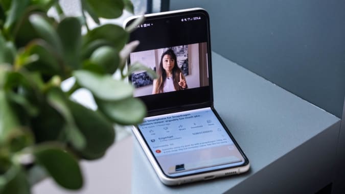
Something else the Flip offers that regular smartphones don’t is a Flex mode that kicks in when you half-fold the device. This only works on some apps, like Gallery, Camera and YouTube, where the screen is split in half to show your photo, viewfinder or video on top and navigation, controls or more info at the bottom. When you set the Flip 3 up on a table in Flex mode, you can watch your show as if it were full screen on the top half, while scrolling comments or suggested videos below.
I thought I’d only find Flex mode useful with the Flip 3 sitting on a table (propped up like it has its own kickstand), but it actually was more helpful in enabling one-handed use. Because the screen is so tall, some elements are out of my thumb’s reach. Flex mode makes scrolling pictures in my gallery or snapping a picture much easier with one hand. So far, though, only a handful of apps support this, so Samsung will need to work harder to make more of them compatible.
CamerasThe Flip 3’s dual 12-megapixel cameras hold their own against the likes of the Pixel 5 and iPhone 12 Pro. While Samsung, Apple and Google all have minor differences in the color temperature of their photos, they deliver similar quality and clarity in most situations. The Flip 3’s picture of a yummy bowl of noodles was just as bright and vibrant as those taken with the Pixel and iPhone, though it’s a little soft and failed to capture some detail on the ceramic surface.

David Imel for Engadget
Photos the Flip 3 shot at night are also similar to those from the competition — you’d need to really scrutinize minor exposure and noise differences to tell them apart. The pictures I snapped of a dog park and the city skyline at night all came out bright and colorful, though Google delivered a better closeup of the New York City nightscape thanks to its superior processing software.
The selfies captured by the Flip 3’s 10-megapixel camera were also bright and sharp. And, based on an informal poll on my Instagram, the majority of my followers preferred a portrait shot by the Flip 3 to the Pixel 5.