The new LinkedIn: a restyling and the Stories

LinkedIn: interface restyling and Stories
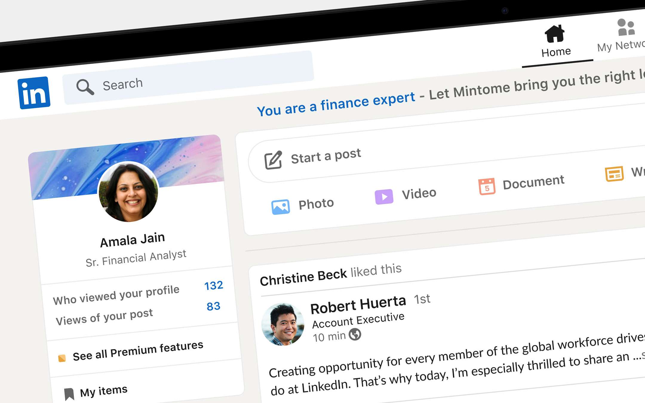
The stated goal is to improve the user experience by intervening on aspects such as the ways offered to stay updated and in touch. It was decided to focus on the sense of community, particularly felt in recent months characterized by distancing and smart working. In the image below a first look at the redesigned layout.These are the principles taken into consideration by the LinkedIn team during the redesign of the layout as stated in the press release that came to the editorial office .
Warmth: the warm color palette uses blue and green base tones and accents to signal action and selection, as well as new illustrations and more rounded shapes for a softer and more friendly experience. Intuitive: The new design optimizes space, size and typographic structure to make LinkedIn easier for members to understand and navigate. Simplicity: the graphic aspect has been simplified with the addition of more white spaces and the reduction of the number of dividing lines and decorative icons. Inclusiveness: LinkedIn has created new illustrations that incorporate a wide range of sectors and professional backgrounds and represent professionals of different ethnic origins to give space to the vitality of the community and the different perspectives that exist on LinkedIn. Accessibility: This new experience has also been designed to meet LinkedIn's accessibility standards and is expected to introduce a Dark Mode soon. The news doesn't stop at the UI. There is also the integration of the video component in the messaging with the possibility of passing easily from a text conversation to solutions such as Microsoft Teams, BlueJeans or Zoom for remote communication.
Steps forward are worth noting also on the research front with the debut of an updated system to allow you to get to what you want more quickly: offers for a new job, a contact, a group, an event or content.
Stories are also debuting, a functionality borrowed from other social networks and which seems superfluous to us to explain again.
We conclude with the translation of the comment on the new CEO Ryan Roslansky.
No, Stories are not new, but we took the time to understand how this format could integrate into the professional context that defines everything we do and happen on LinkedIn. Through tests conducted in various regions of the world we have seen our members use it to connect more personally and less formally with their acquaintances and friends.
Source: LinkedIn